Building on tradition, designed for the future.
The Marsh brand, having lounged in the realm of outdated aesthetics for what felt like an eternity, embarked on a remodeling journey, craving a visual narrative that would not only propel it into the 21st century but also tell the compelling tale of a family business with a legacy spanning 115 years. Picture this as the brand's rejuvenation odyssey—a narrative makeover from vintage cabinets to a contemporary allure.
The challenge at hand was not just a facelift for the iconic "M" logo but an updating of its visual story, ensuring it resonated with a tech-savvy audience while preserving the narrative essence. This wasn't a mere refurbishment; it was the rebirth of a classic character for the digital age.
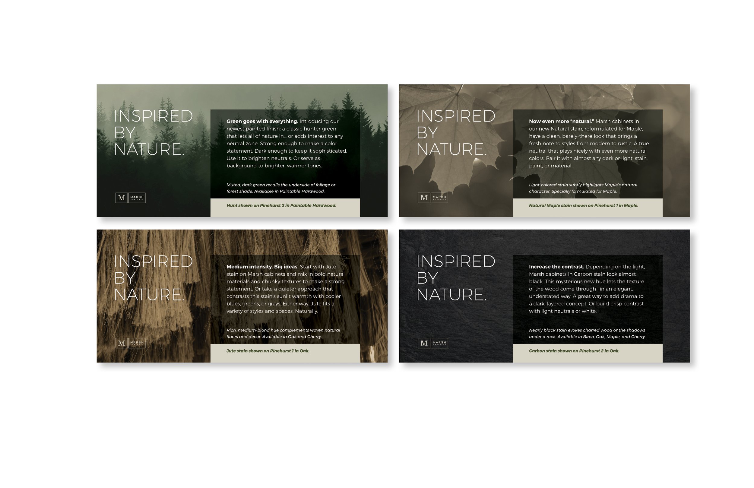
In the chromatic chronicles, the directive was clear: bid farewell to the Oatmeal color, a relic from yesteryears, and usher in a palette of sophisticated neutrals. Think of it as a color symphony that harmonizes with the modern era, complete with a spectrum of light hues to illuminate the brand's narrative canvas. Amidst this chromatic transformation, Marsh Green remained the protagonist—a hue that encapsulates the brand's enduring identity.
But what's a tale without its visual poetry? Enter the realm of storytelling design—a quest to create a visual language that tells the story of skilled artisans crafting timeless cabinets. A collection of icons, patterns, and backgrounds became the brushstrokes of this visual narrative, each stroke adding layers to the brand's story. It wasn't just about cabinets; it was about weaving a visual tapestry that spoke volumes about craftsmanship, tradition, and the exciting chapter that awaited.
So there you have it—a modernization saga, a chromatic transformation, and a foray into storytelling design that doesn't just refresh the brand but turns it into a compelling storybook, ready to captivate a new generation of admirers.
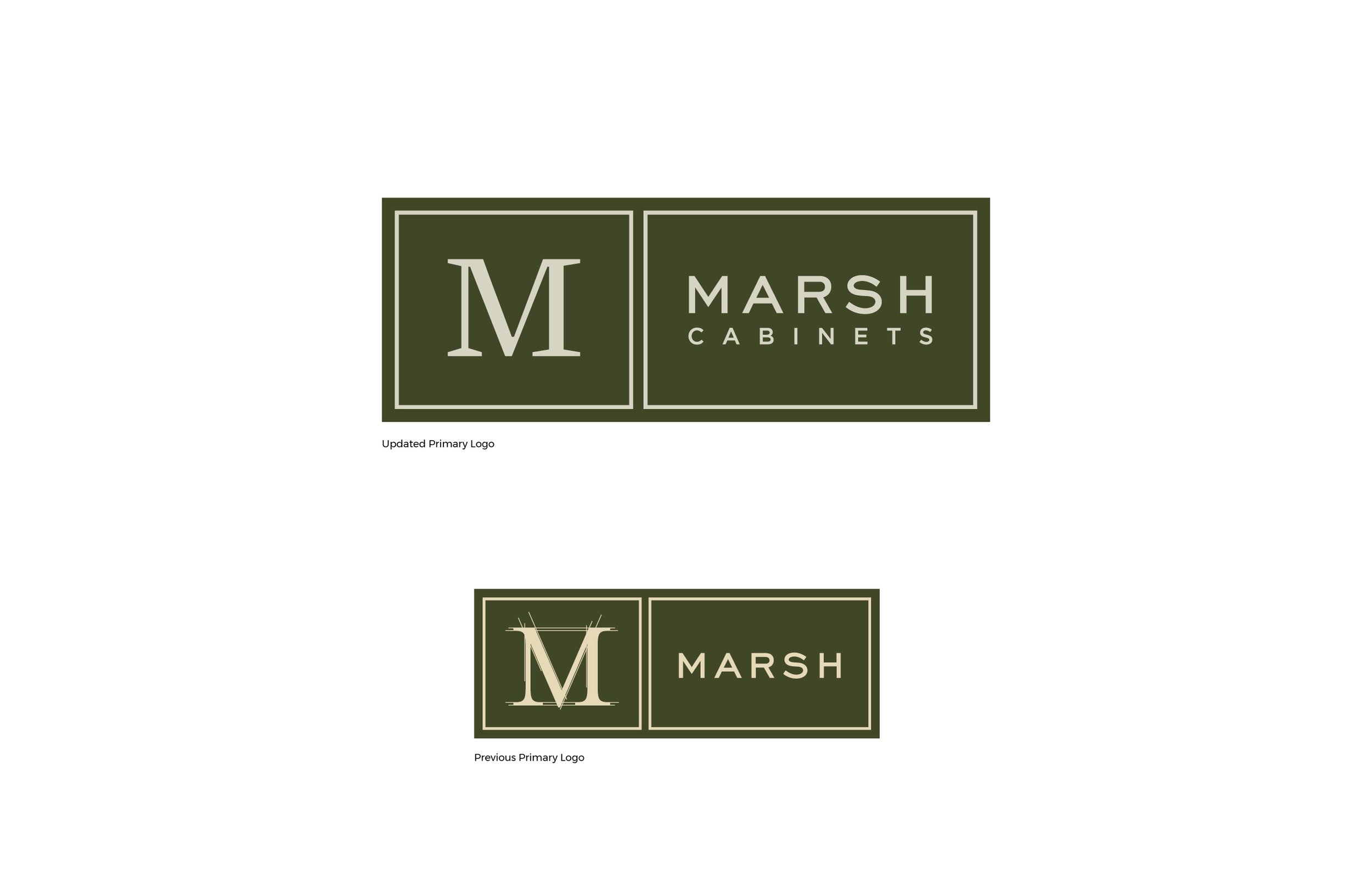
Marsh Cabinets updated logo and previous version
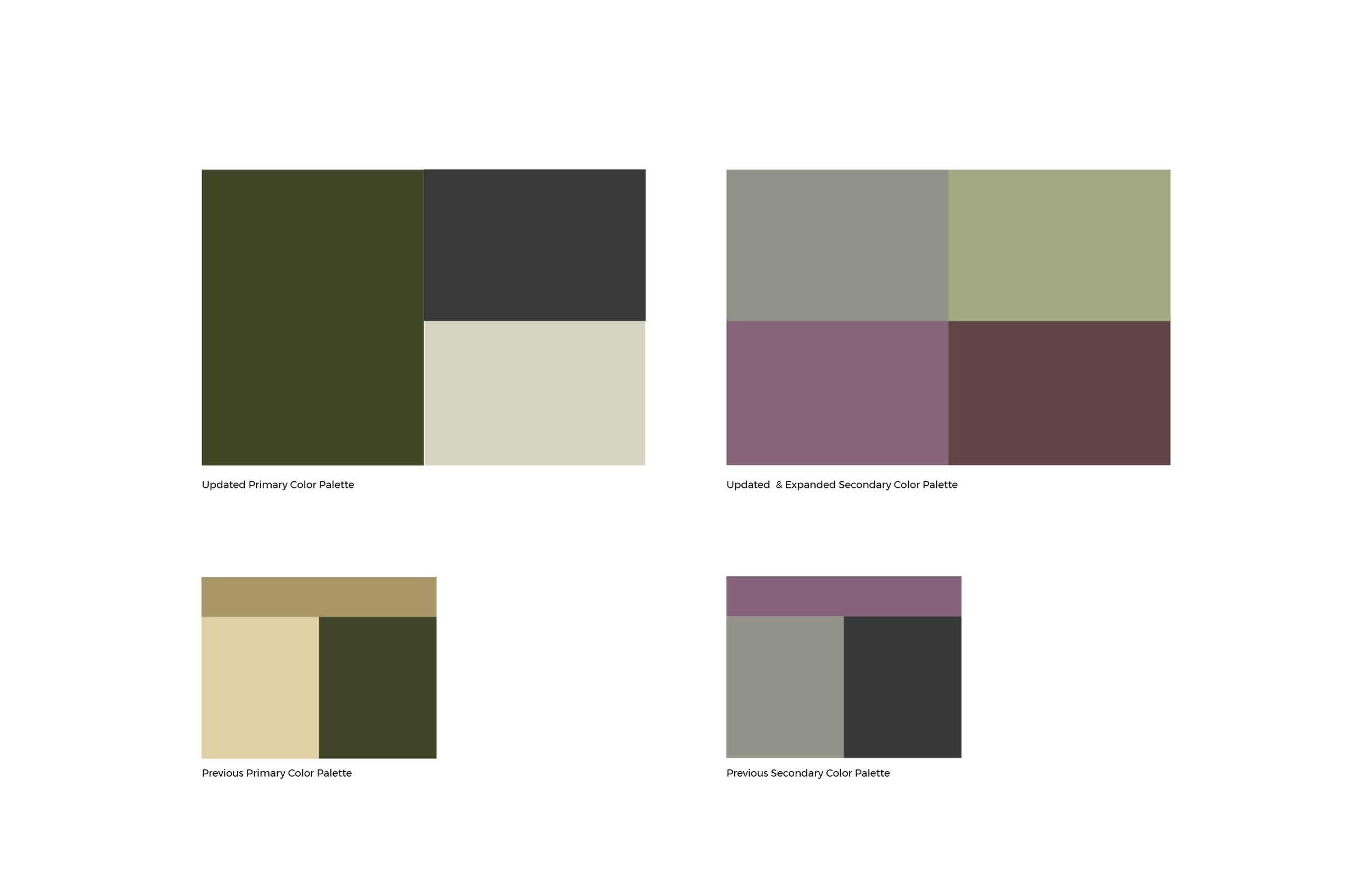
Revised brightened color palette
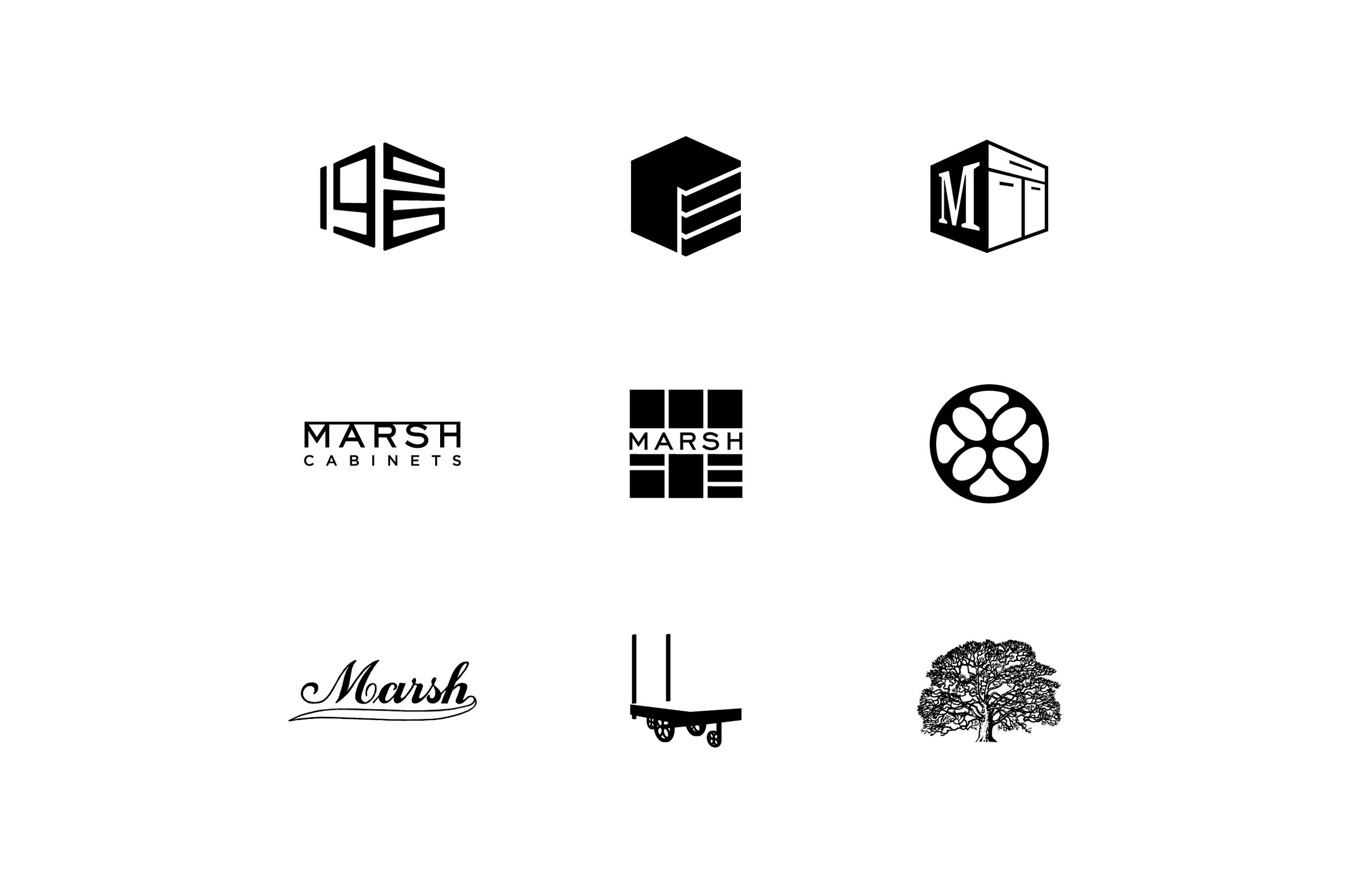
Iconic elements that help reinforce their products and help celebrate their 100+ year heritage
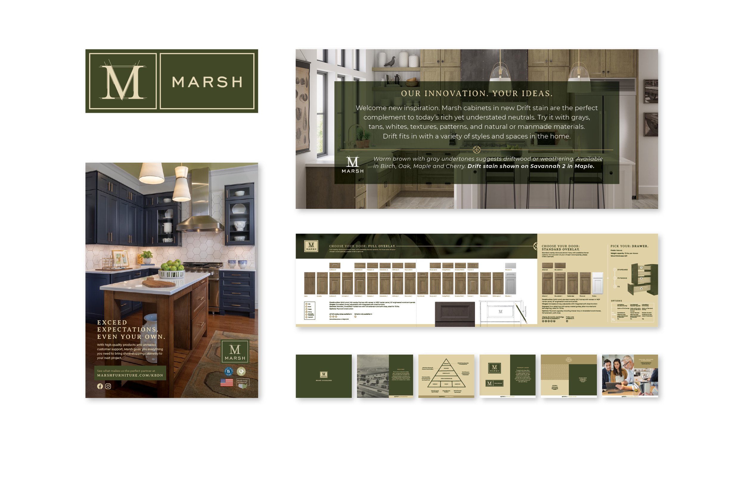
A sampling of the previous brand communications
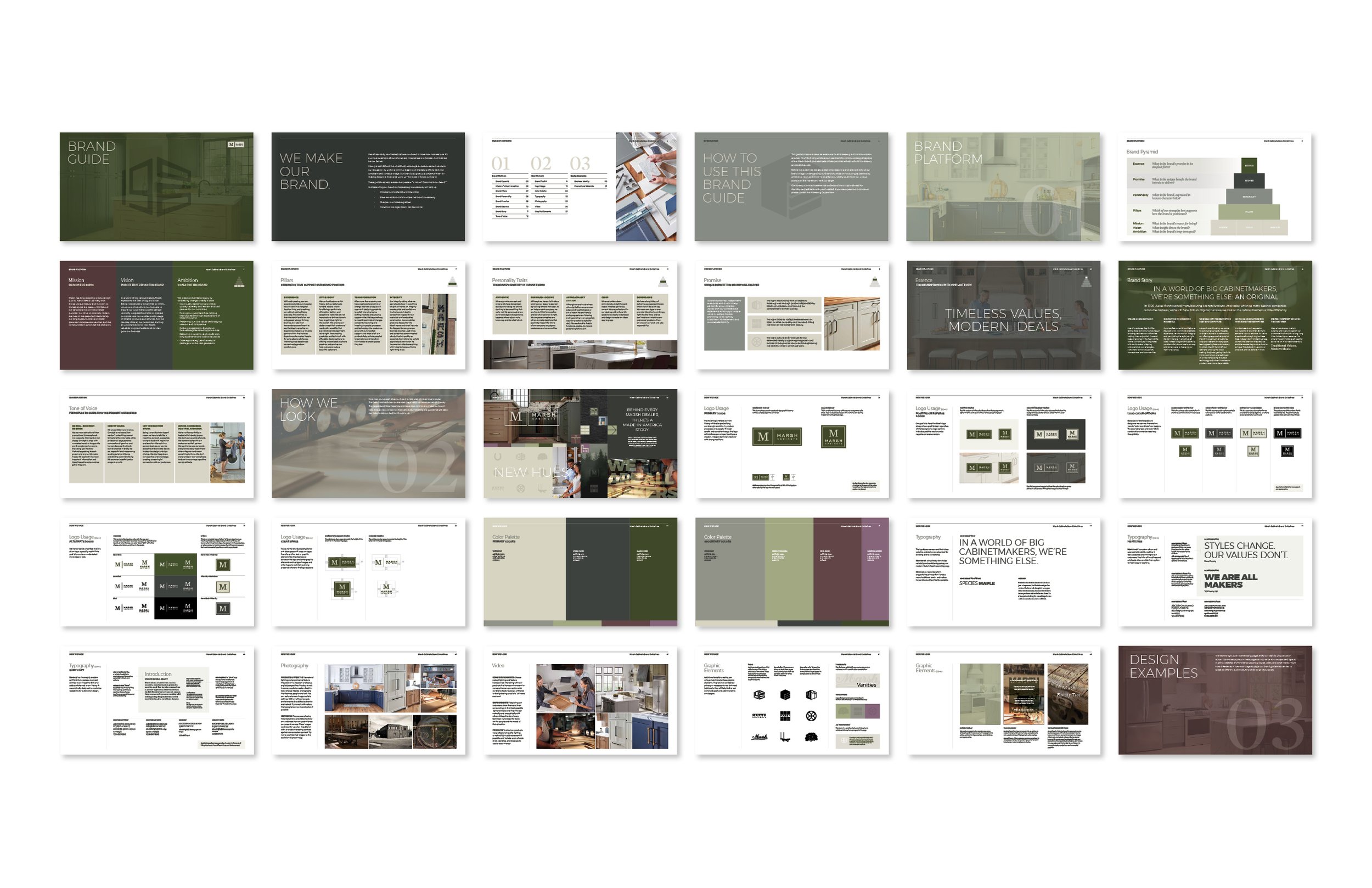
New brand vision and guidelines
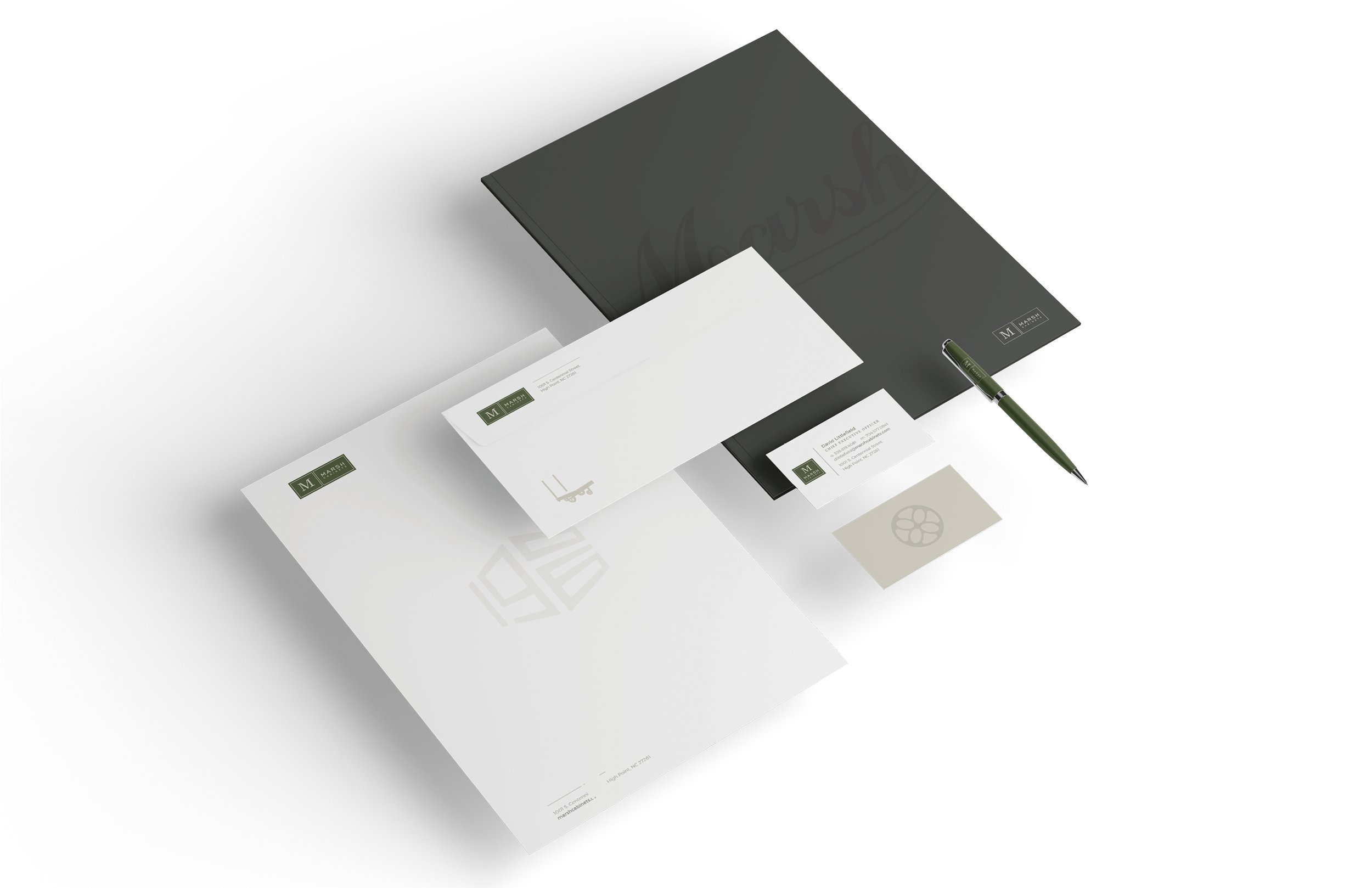
Updated stationery system
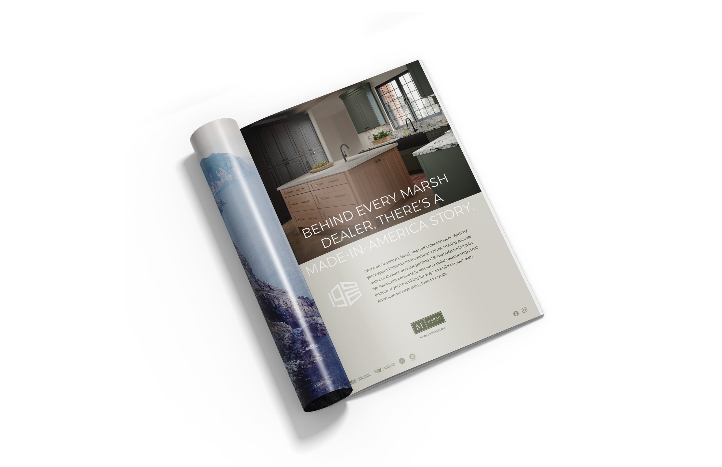
Trade advertising
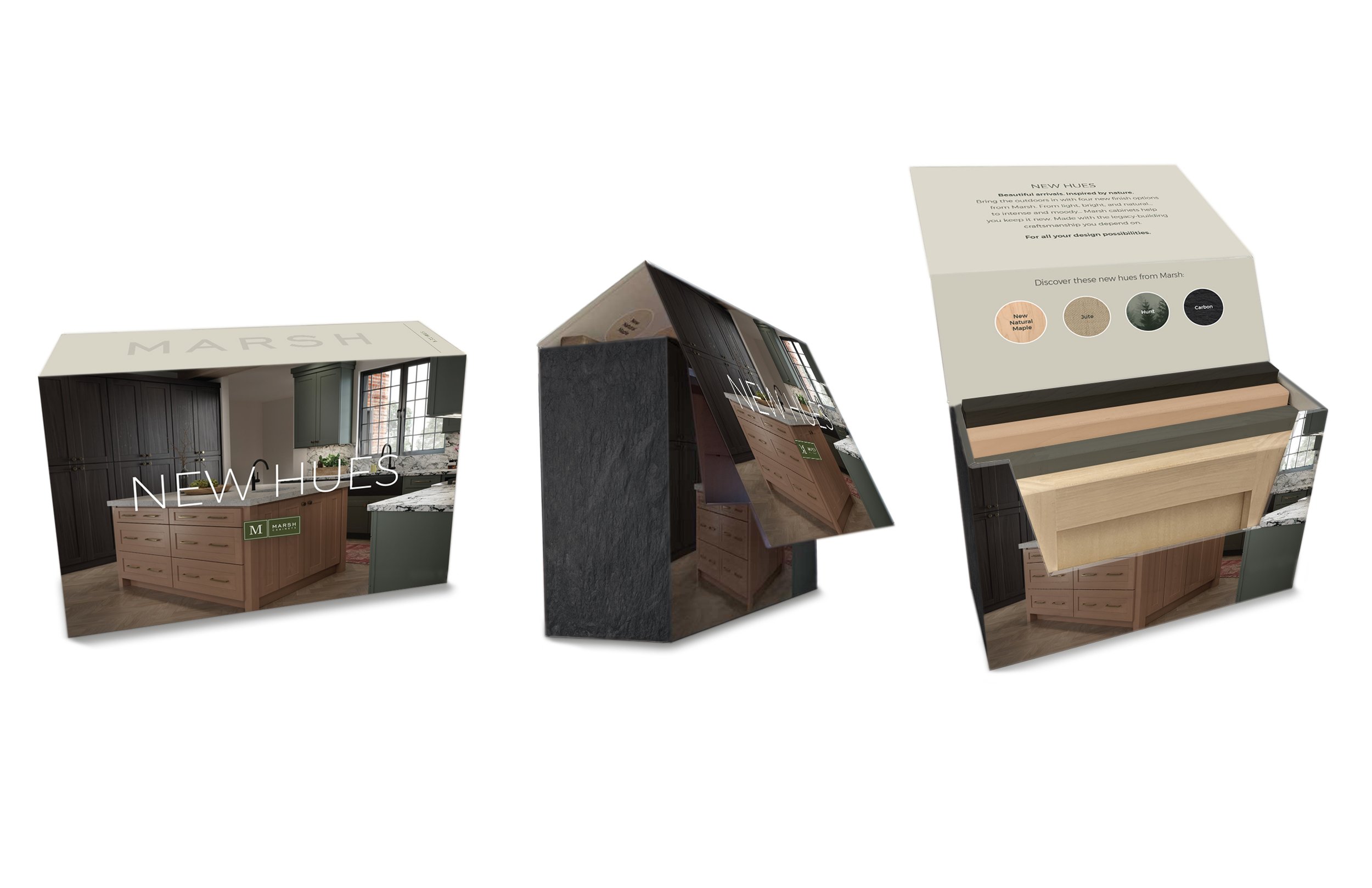
New Hues promotional box
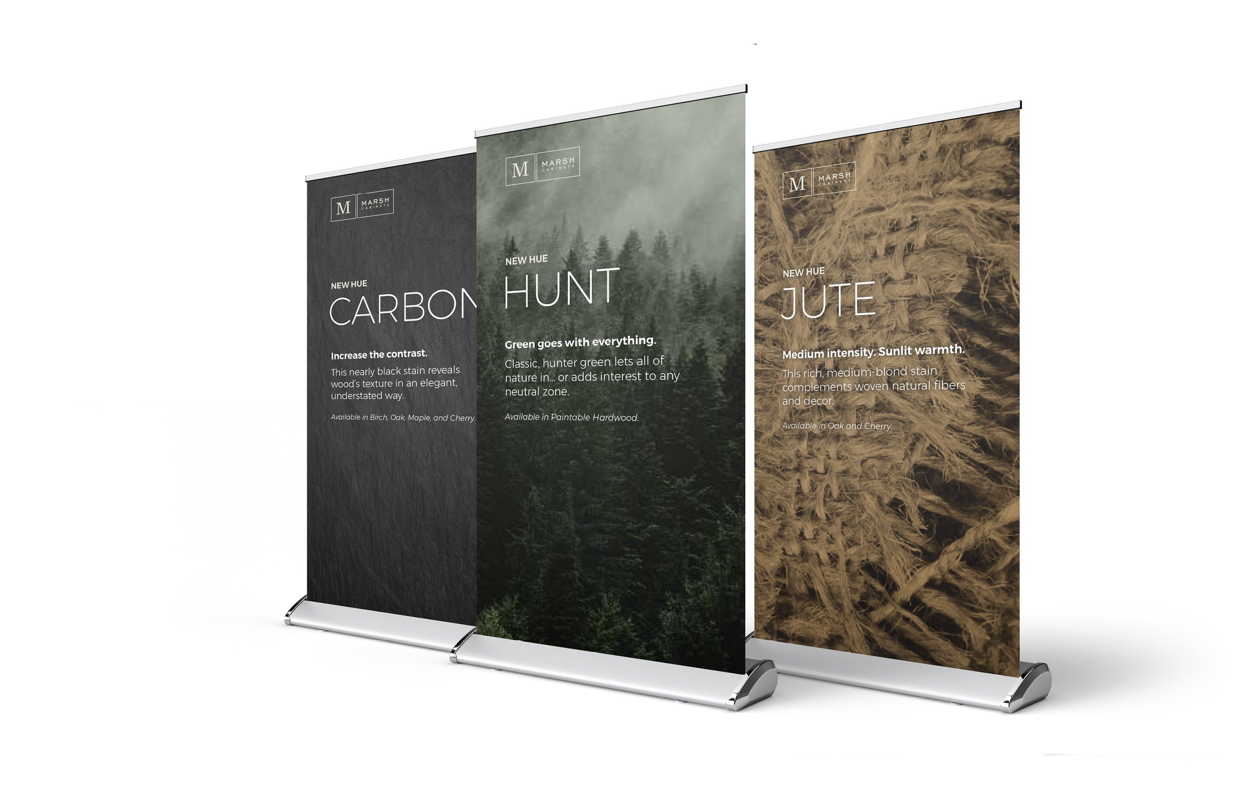
Sales Summit pop-up banners
Promo box labels
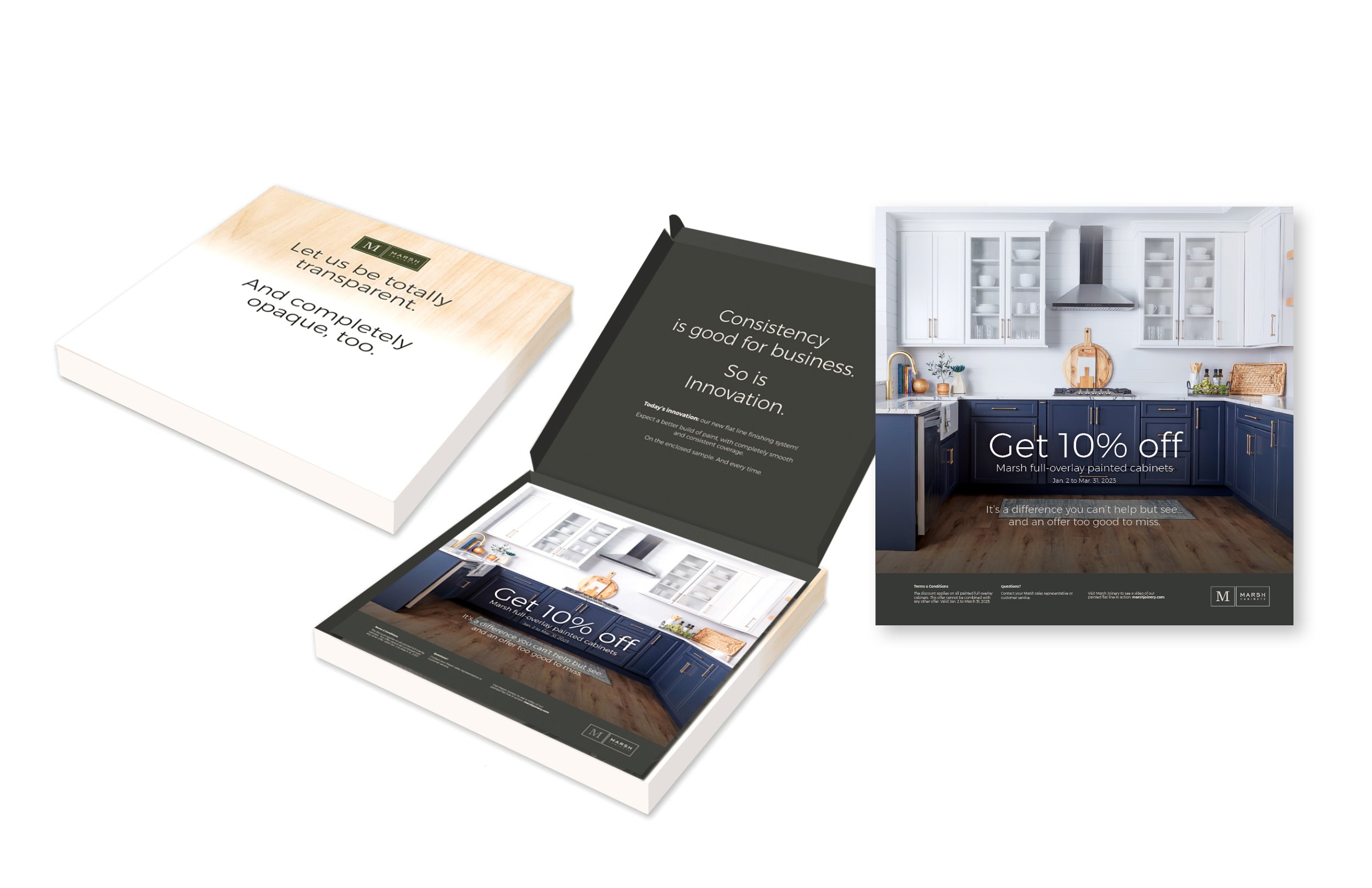
Direct mail kit